How to use Frequency Separation
Intro
Hey guys, my name is Rick Navarro and this is the Pixel Laundry Retouching Academy. Today we’re going to be talking about hot use frequency separation. What it is? What it does? How you can use in your workflow? Stick around because this is where we teach you how to retouch like a pro.
***Please note, that the below blog entry is the transcribed audio from the video for this entry. To get the full experience to be sure to watch the video on this page or go to the Pixel Laundry Photoshop Academy YouTube channel. Be sure to subscribe to get all the latest tutorials! Also if you need retouching services, we encourage you to check out our portfolio of work at Pixel Laundry. We are clipping, background removal and retouching specialist that service traditional and online retailers, advertisers and entertainers. Please don’t hesitate to reach out for some free samples and an estimate on your project. ***
How Frequency Separation works
Alright lets jump right into it. So frequency separation; you may have heard of this. It has been around for a while, it’s a technique where you’re basically separating the image into frequency layers. Now frequencies kind of work like sound. So if you think about sound, sound works in waves, sine waves, and in the image world is no different. So basically what frequency separation is doing is, separating the frequencies, the high and the low frequencies, so that you have a greater level of control in your image.
So let’s just go ahead and get right to it so I can illustrate this for you, because we’re, we’re very visual people. Every image can be broken up into two frequencies. Your images can be broken up into what are longer frequencies and what are tighter or shorter frequencies or what you could call a low and a high. So these lower frequencies are represented by the Green Line and it’s where you are going to see a lot of the tonal values and colors. The blue line here represents your high frequencies where you can see a lot of texture, where you’re going to find a lot of detail that you might be able to find in the hair or in skin or in sometimes in some places even clothing and why this is important for us is because if we separate them, we can edit them on an individual basis as opposed to together. Now this is a great technique but what I have found in a professional capacity is that it doesn’t work for everything. I mentioned in another video on flawless skin retouching which you should check out right here that it’s really about the tool for the job.
So if in one situation you’re doing a lot of beauty work (and beauty b.t.w. if you don’t already know is basically anything from about the collar bone, up think hair, think makeup, think close-up fashion-like products; anything that shows a face from about here up is considered beauty in the photography industry) in a photographic professional world and that would be true for anything retouching wise as well. This is where this really shines is technique. Basically makes an entire body of just this section of the image whereas a full, an actual full body image, obviously the image is going to be further away and you’re not going to have as much detail or detail that scene.
Consider the End Usage before your workflow
Now again in the previous video, I talked about usage and how usage is everything. End usage will dictate your workflow or it should because you’re not wanting to spend three hours on a full body image when it’s only ever going to be seen on a phone. It’d be a foolish waste of time and in a professional capacity. If you’re working for yourself and you want to retouch right down to the pore, that’s one thing. If you want to get every meticulous skin shade bump and you know hair like down to brains you know then by all means go do that, but in a commercial capacity often times you’re working up against deadlines and budget constrictions so you are constantly struggling with the balance of retouching in a capacity that is the most efficient way you need to balance out the amount of time per image. You need to balance out the quality of the image, you need to balance out how much are you getting paid for this image, is a client paying you for your time and if they’re paying you for your time, are you using that time you know the most efficiently as possible? So when you are choosing a method of research and what you’re going to do in terms of your pipeline and your approach, you have to be strategic. Frequency separation is really great when it has its place. I know high end retouchers who refuse to use it because it honestly just creates more steps. Then I know people who swear by it and that’s all they do on every image they do, because it gives them that greater level of control.
For me personally it’s really about the tool for the job. So if the job dictates that and it’s a tight image and there’s going to be a lot of detail in the tight image, even if it is only going to be seen on a phone but because the image is so tight and there’s so much detail that you can’t actually see some of these you know details on the phone then I’m going to go ahead and use the frequency separation. If it’s a lot of e-commerce catalog types of images where I’ve got a large volume of images to go through but they’re only going to ever be seen on the phone, they’re going to be seen from far away with maybe a little bit of zoom factor but the images are going to only be seen for a short period of time, it’s not going to live in print for a very long time then I’m probably not going to use frequency separation because of the amount of time and the cost opportunity that is there.
First Steps
I’m going to show you today the steps on how to break them down step by step if you wanted to do it manually but then I’m also going to show you and provide for you in action and the show notes that will automate the the first five or six steps and then you won’t even have to worry about it. Now one caveat to that is, is that every image is going to be a little bit different. The amount of some of these filters that we’re going to apply may change with the type of image and how high-res they are or how low-res they are but you’ll see that once you get the automated process you can easily make quick adjustments and move very quickly.
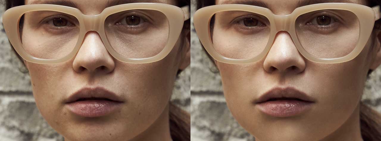
Okay so without further ado, let’s just go ahead and get into it. I’ve already pre-selected some images from clients that I’ve worked with in the past that I think will serve this purpose really… really well. This is one image; it’s already been worked on but we’re going to start from scratch just for the sake of what we’re trying to show you here today. So the first thing you’re going to want to do is get rid of that like we’re starting from a fresh image again. This is like a beauty shot again, shoulders, chest and shoulders up a lot of detail in the skin. As we can see, there’s a lot of blemishes here and as well as just kind of you know tonal adjustments that we want to make like around the eyes, some texture issues here with skin and some little flyaway hairs that we’re going to go ahead and address.
A few different methods
I’m going to show you two different methods on how you can get basically the same result and I’m going to show you why you might use one over the other. Actually it’s really simple, some people believe that the algorithm on the one on this first one I’m going to show you is a little bit more accurate so that it sets you up for a win in your retouch right from the beginning. The other one tends to be a little bit faster, extra all of them become really fast but you start using the action so you can jump right into your retouching but they’re both built off of the same premise and you can kind of pick one which suits your workflow you know, once you see how they work.
All right so here we go, here’s this image, this first one, this person we’re going to show you is with the apply image filter and in both sets are going to duplicate the background image twice. Go ahead and turn them both off and why actually turn that top one off and let’s just go ahead and label this bottom on your low-frequency and the top one on the low one we’re going to go ahead and go to a Gaussian blur and what I’m basically trying to do here is eliminate any of these finer details, these textural details so let me crank this up a little bit right about there so I’m not getting so much of the particulars. Okay then I’m going to go to my high-frequency layer and go to image, apply image and I want to use the low-frequency layer I’ve just created. I’m going to set this to add. Should be 100 scale too. I’m going to click on the invert it okay. As you can see here if you’re familiar with Photoshop, it kind of gives you what you’re going to get in a high pass filter. Anyways then I’m going to set this to linear light and as you can see we’re kind of back to where we started if I toggle on and off between the base layer and what I’ve just created. There’s no, there’s no change back to the base layer. So on this top layer here you’ll notice that I’ve got texture detail.
And on this bottom layer I’ve got color and tonal value. And you can edit them separately to give you a greater level of control okay? So that’s one way to do it again. Here’s the second way and this is with high-pass filter directly. I just showed you is supposed to be more accurate and I guess you could say that’s kind of preferentially based you know. In my professional experience, in terms of accuracy, you could split hairs on that. You go either way so I like to go with what’s the most time-efficient and honestly that’s going to be through using an action but if we’re breaking you down so you understand the fundamentals of it.
You know you can use this technique as well so again I’ll go ahead and group those back so I’m going to go ahead and leave that because I’ve already created it. But I’m going to show you the second one, now duplicate those and let’s just go right to the high-pass filter, other High Pass. I like this one because it gives me a greater level of control right in my hands, right from the slider. I’m going to visually look at what is being added and what’s not. What’s tricky here is obviously you don’t want this level of detail. Now I’m getting more tonal values and I’m not looking, really looking for those frequencies in that range. I’m looking for the frequencies that are just going to allow the texture now if I slide it all the way down you can see that. I don’t get any detail here at all, so let’s slowly bring this up and now you’re starting to see some of that texture come through. Let’s just go 3.8, it’s kind of a nice balance so I’ve got a lot of the texture detail but I don’t have too much color and tonal value in here. He’ll find details wrinkles on the skin the hair and this gives me texture in the chest as well.
Anyway so I think this is going to be a happy balance. Again I’m going to set this to linear, and this to the Gaussian blur. Now look how fuzzy it is. There’s a trick I want to show you, this does not look like our original image right here and that is because I over blurred it over here in the Gaussian. So what you want to do is go back and I’m just going to go back here which is just before that and if you’ll remember I believe my… my high pass was set to about for 4.2, 4.1 is so I’m going to apply that same level of blur to that layer let’s just go ahead and go 4.2 again. I’ve lost some finer details even though this is a little bit, a little bit more focus so what you want to do is use the exact same number I’m going to leave it, just for your sake for time sake because I actually like what’s happening to the skin right now. But again you can see how one might be a little bit more precise and also how so this is the second way I’ve got them both already created here and then now it’s just your basic retouch as you normally would.
Advanced Technique
Now I’m going to show you a little bit of an advanced technique that will again allow you a little bit greater level of control. What you want to do is here is create a new layer in between here, you are going to set your brush to your stamp, like if you’re using a stamp tool you want to have it set to current and below and since I’m working in between here that’s going to allow me to work on you know some of these tonal values in-between without actually messing up the layer. Now personally this is just an option that you can use here, you can kind of use a low opacity to kind of buildup and control some of these layers. Actually I’m going to raise it up just a little bit and you’ll see that I’m cleaning up so that tonal value but because I haven’t done anything actually miss control, yeah it’s picking it up so let’s go and do that first.
Now I’m using content-aware fill to kind of quickly move through some of these tones. And then if it doesn’t remove what you’re trying to remove automatically, go ahead and do both edits on both sides of this again.
So those are texture edits. Let’s go down here to the color actually, let’s go and put that layer in between as I was saying. So if I want to sample some of this color now from this good skin over here now I can kind of come in here and build up with a low opacity brush I’m pretty high right now because I’m moving quickly and I feel like I’m fairly certain of how this is going to react but what you could do is you could drop your opacity down of your brush and build It up very slowly to kind of lighten maybe some of these darkening, there’s darken areas I’ve mentioned as, I’ve mentioned in some of these pretty previous videos you’re going to want to zoom in and zoom out so that you can see at different distances what shadows you may or may not be created. See here’s it before and after, we flattened out some of that tone okay but yet we have all the skin texture maintained. Okay so as you can see we’ve got all of that skin texture maintained and some of the tone has been flattened out a little bit to kind of smooth it out her forehead and you basically go through the entire image like that and that’s what I’m going to do now.
Okay as I mentioned before, I like to do like if I don’t see it for some reason like my eyes catch something that is what looks like it’s on the texture layer but it’s actually on the on the low frequency or the color or tonal layer, I’ll go ahead and apply the same just right as I have it selected. I’ll apply the same content-aware fill to both the high and the low frequency so there’s no guests and then this likes reserved precise so that’s what I just did there and see already we’re getting a cleaner a nice kind of clean up very quickly. Well hasn’t been quick and that’s my point when I’m using this it really kind of just depends but because this is a beauty shot I might spend a little bit more time.
Tonal Values
So let’s go ahead and fix some of these tonal values that we’re saying I’m going to eliminate. I’m actually going to merge these two because my personal preference is to work directly on this blur layer sometimes I like to turn it off and only work on that one because I’m not scared of losing any of the texture and I’m only really using some of these, these tonal values. I’m going to pull them out. Now I mentioned in a previous video that I like to pull sometimes from areas that are completely not relatively close and that’s to kind of just flatten out that skin, sometimes like when you pull like just like that like you pull, like a closer area, it doesn’t work as well. Sometimes it does, it just really depends on the image but I think like I did that one far so actually, let’s just, I’ll do this one. I’ll show you and I’m just going to pull on a sample from an area close by and again I’m sampling from several areas.
But you see how like this is a perfect example. It’s just requiring a little bit more finesse. Getting some of that light out. Now you can see how those dark patches under her eyes starting to flattened out with the beauty is, I haven’t messed with any of the texture so the skin remains, it’s it maintains its integrity. Now you can leave it on to kind of see how it’s affecting it. The cool thing about frequency separation is, is once you get the hang of it, you’ll start to kind of visually separate the texture in the tone before you even start an image.
You can kind of, your eye will get trained to see tone and texture as two separate things and then you’ll start to see where okay over here I need to make a tonal adjustment over here.
I need to make a texture adjustment and that helps you move through the image really quickly. Some of the discoloration under chin, I’m going to flatten it out. These little cheek buckets the jowls and everyone from babies to senior folks has them. I’ve worked with incredibly beautiful models that still have jowls. I’ve worked with celebrities who still have jowls. It’s one thing I’m always kind of looking at to remove and I see them left in and a lot of these images and I always wonder why. I’m like there’s always a bit of a tonal shadow that happens right here at the corner of the mouth. No matter how pretty, how perfect, how flawless, how beautiful the model is, young, old, professional model or an amateur everybody’s got it. It’s just a natural gravity that affects our face, you can use a combination of the patch tool or the stamp tool to kind of work through some of these areas, flatten them out again. You can start with a lower opacity and build up which is just definitely a safer way to work. It’s a very fine balance between realism and pushing the image too far you know that becomes a stylistic and a preferential kind of thing based off of your own preferences or the clients.
Now I start to work back and forth to adjust some of these things that I might not be seeing or catching as I’m very close or as I’m far away but you can start to see how frequency separation is pretty awesome but it’s also really time consuming so it just kind of depends on your client. The workload your pipeline you know if you have a staff if you’ve got people that are working with you know or you’re responsible for doing this, let’s say one-commerce is like a lifestyle or like an editorial type of shoot it doesn’t really make a lot of sense to do even, even with the action you know the images are very far away, you know the posts are very close up like this one, you know it may not make a whole lot of sense to do feel like this chin is a little blotchy. Now color correction is an entirely separate name keep that in mind. Well color will be influenced, here your approach at retouching it can be completely different. I don’t know if you can see what I was just doing but I had I’d gone too far so that’s such a great example of issues that you may run into but if you’ll notice I sample from another part of the face to bring that cheek, that highlight that fatty part of the cheek that’s getting hit by the light back in and flattened out and it had disappeared.
So basically what I did is, I pulled from the cheek over here and sampled it to bring it back in and then it grabbed a few other things but it didn’t matter because once I had the shape that I wanted then I could get rid of, so maybe some of those other areas that weren’t very flattering to the face okay so now we’re controlling. This is all before dodge and burn which is going to be an entirely separate video but again this is helping you understand how frequency separation can really give you great skin even though it’s time-consuming, maintain all the texture still feels very real. I haven’t even gotten into dodge and burn but that’s basically your frequency separation.
Pulling it all together with an Action
Okay I want to show you one more thing, here’s another image that I think will work really well for this but now I’m going to show you, I’m going to show you how the action works.
I provided a link in the show notes once you get your actions installed or if you don’t have installing, you can install them right here if you open up your actions palette and you click on your triple lines up here and you go to load actions. You can load your action and the action that I’ve given you here it’s called PL frequency separation. Once you have it loaded, if your image is 8-bit which most images are, if it’s not you’ll know right here, 16, 32. So if you’re using the action that I’m going to provide for you in the link, in the show notes below you’ll see that you can install them through here you want to just go through load actions make sure your actions palette is up. If it’s not go to window and actions and then you’ll hit your options bar here and go load actions there, it is PL frequency. I’ve already got it loaded, I just wanted to show you that and you’re going to make sure you want to start on a completely brand new image and know what your image color bit is whether it’s 18 or 6, you’ve got options from both in there so go ahead and click on 8 I know that this one is an 8 and you’re going to play here’s that dialogue that comes up. Remember it’s going to be different for every image so I’m blurring out all the details, make sure you, make me sure I have just tonal values here they hit okay? And you can see the high frequency has already been created for me and I’m basically ready to go now. I would just proceed and retouch at this image as I normally would again. This is separate from dodge and burn which is another technique in combination with this one that will really give you beautiful images but for now that’s your frequency separation so you can see how much faster it is. Once you have the action, once you understand the concept then you can apply it accordingly and not worry about you know duplicating and applying image and then all this other stuff so it helps you move once you have it in your workflow, you can incorporate that to process out images much quicker again. Personally I still wouldn’t use it on a large batch of catalogue images, but if it’s a one-off a lifestyle or smaller batch, that’s more concentrated that needs a higher level of quality then it’s phenomenal guys.
In Conclusion
Thank you so much for watching. I hope you learned something, I hope you really enjoyed that. Be sure to LIKE, subscribe and hit that notification bell so that you can get updates on our future videos. If you’ve got ideas for future episodes or something that you don’t know or something that you’re just trying to figure out, comment in the comment section below that’s going to help us out a lot and it’s going to help us create content that’s relevant to you. Alright guys we’ll see you next time.